Saving small businesses through customer loyalty
Prior to me joining, Surkus was an experiential marketing platform that offered big brands unique customer activations through live events and digital offers. Companies were able to leverage Surkus’s existing membership base of social media influencers to amplify and promote their products. In late 2019, it became apparent that the same marketing methodologies could be applied to small, local businesses.
In early 2020, I was brought on to co-lead an ambitious project to provide an affordable loyalty-based marketing solution for local businesses. Utilizing existing infrastructure and working through constantly-changing government mandates, we successfully launched a minimum viable product during the worst pandemic in US history.
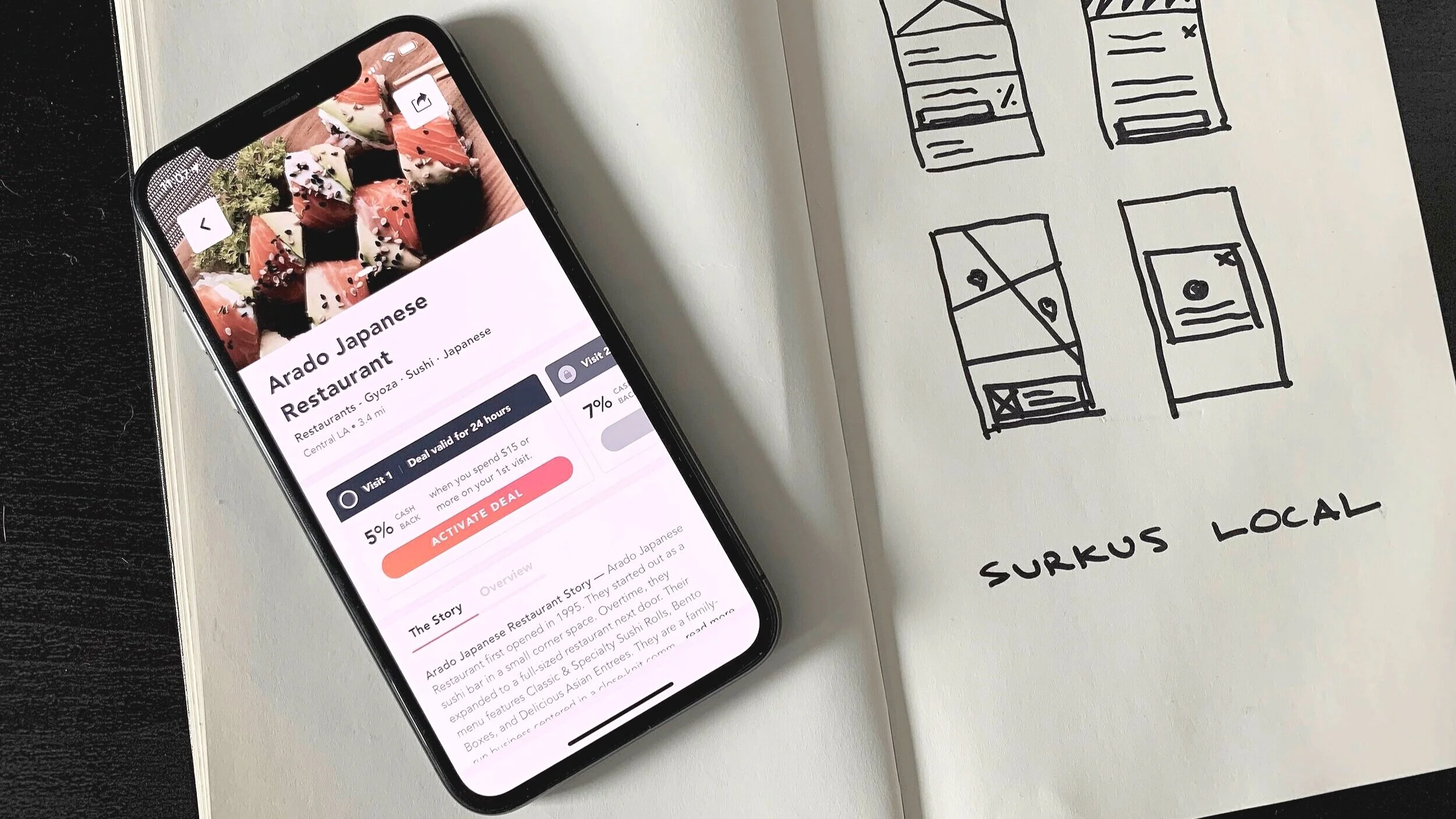
Surkus Local is a cash back platform that provides customers with tiered rewards for continued loyalty, converting skeptics to loyalists while deepening small business engagement.
Ideation, validation, and launch
Our goal for Surkus Local was to bring a vetted, minimal viable product to market without having to sacrifice the design process for speed. Our main challenge was to create a usable customer loyalty program to sell to local businesses. At a high level, we wanted to:
Create a scalable platform that supports ongoing customer loyalty at small businesses.
Make it simple, engaging, and rewarding to use.
Establish a strong design process based on research, validation, and iteration.
My role
As the lead designer working alongside 2 product managers and a design director, I owned the entire design process and shipped the initial experience for our MVP. I served as a full stack designer from strategy and research, to product execution.
I also worked alongside our design director to present work to stakeholders throughout the project lifecycle and built our initial design system with Figma and Zeroheight to facilitate developer handoff. Our team followed a traditional breakdown of responsibilities with the exception of design owning most of the overlap.
I joined the team in March during the beginning of lockdown, The Surkus Local app launched out of beta and onto the iOS app store on August 7th, 2020. Due to unanticipated government mandates, we were delayed a month and a half.
The process should not be a pain point
I’ve worked at a few early to mid-stage startups now and a common theme that I see repeatedly is with stakeholders wanting to sacrifice the design process in order to ship faster or create off of a hunch. Although I do agree that getting a product out to market as soon as possible and learning from it is essential, talking to potential users early on and designing to solve actual people problems is the most important part of building a viable business. I was blessed in this situation to establish strong research foundations and design processes from the start.
After arriving, I worked quickly to uncover market opportunities through competitive analysis and utilized those findings to collaborate on the design of a prototype. From there, I recruited potential users and conducted remote usability sessions to validate our design hypothesis. With those learnings, I created personas which we used to iterate on the design of the app. All while working with the product team to ship the pieces we assumed would not change in order to meet a fixed deadline.
Uncovering market opportunities
At the start of the project our team did not have any real clear strategy other than creating a product that facilitated business loyalty so I set out to conduct some market research to see if this was a viable strategy.
For the competitive analysis, I conducted a full service audit of major cash back and incentive based loyalty apps. We understood that incentive based customer activations worked historically, but we wanted to take it a step further and apply it to recurring visits.
SWOT Analysis of competitive products
Based on the analysis it became clear that there was indeed space in the competitive landscape to build digital loyalty, but with local businesses. All of the existing business models only offered one-time activation incentives with big box brands.
Competitors geared towards one time activations
Competitors geared towards big name brands
Leveraging quantitative surveys to test viability
After seeing some positive indication that there was space in the market to offer customers local incentives, we sent out a survey to gather some quantitative data to find out more about our hypothetical users. We also leveraged Surkus’s existing member base to gather data.
Initial findings
We polled around 1,000 people 65% representing existing members and 35% aligned to our core demographic. Overall, based on the quantitative data, we found that members and potential users:
Were very interested in local, walkable deals and incentives
They wanted to shop by price, location, and quality
A majority of their spare income went to dining out at restaurants followed by beauty, fashion, and wellness
They typically dined out at least 2 times per week
It made sense to launch with restaurants and bars first, then move into health and wellness
Local business outreach
We also spoke to 50+ local businesses in a variety of locations across LA and NYC and learned that:
Local business clients wanted to target a local customers to drive more footfall
Paid Instagram support and third-party delivery partners were justified marketing expenses
65% had negative experiences with current products such as Groupon, Yelp, Postmates, and Uber Eats
How might we serve local businesses
Armed with some initial data, we ran a design sprint with stakeholders across marketing, product and engineering to ideate on a minimum viable product that would serve the needs of potential users, existing members, and local businesses.
Crazy 8’s
The loyalty card, reimagined.
After some collaborative voting and refinement, we settled on a digital version of a loyalty card that displays on a local business listing page. This mechanism would offer tiered rewards to encourage local users to visit a nearby business more than 2.2 times (our metric for loyalty). We simplified this down to a design that would support 3 deals instead of your typical 8-10 purchases on a physical punchcard. We would incrementally incentivize each visit for three visits.
Wireframes displaying customer activation and success flow
I designed the deal card with horizontal scroll to allow room for copy and an explicit CTA. This would keep us from burying important content about the business vs. going with a stacked design.
Prototype and validate
Working with product to define user testing goals
It was important that we worked with Product to define workflows and tasks to test prior to designing a full prototype. We started with a simple user journey that leveraged Plaid’s payment verification API to support our deal incentive structure. From there, design and product collaborated on questions and tasks that would help define the scope of work for MVP.
Remote unmoderated usability testing
I translated our defined team goals into a usability testing script and plugged it into Maze, a remote usability product designed to be cost effective and efficient. Utilizing Maze meant we could leverage their panel of participants without having to spend a lot of time scheduling and recruiting.
Pushing Maze to its functional limits.
Leveraging Split Testing
For more straightforward design assumptions, we used Maze’s split testing feature to A/B test our business listing cards as well as our deal carousel design variants. The performance of these tests were implemented into the iteration of our designs. We also tested aspects of business storytelling as well as the UX of claiming a deal. Both “A” variants in the images below performed the best.
Results and actionable insights
Overall, the results of our Maze test were positive. However, there were major issues and limitations with the platform that caused concern. We took in some of the more straightforward findings as positive indicators but were skeptical on the rest. Some key takeaways from the Maze usability test were:
76% of participants understood there was a returning loyalty incentive
Users preferred having a sort and filter feature in the overall business listing (added to MVP)
We needed to shrink our business cards on listing pages to reveal more options
We needed to tighten up the design of our deal carousel to expose the deal structure
We needed to strengthen the language and prominence of how cash back works
Plaid bankcard linking was preferred post deal activation
Some major platform concerns that led to a push for remote moderated usability testing were:
Maze was unable to screen participants by our core demographic (Lots of testers on panel were abroad in India, etc.)
Limitations to prototype linking and buggy updates reduced user task completions which skewed results
Panel recruits that rapidly clicked through the missions and tasks resulted in flat feedback
One word answers to in depth questions
Maze is perfect for quick cosmetic design feedback but in no way replaces remote moderated usability testing. Based on this analysis, I was able to convince stakeholders to move forward with remote moderated usability tests in order to de-risk our product launch. We would implement these actionable findings into our designs while I scrambled to recruit and schedule participants for interviews.
Remote Usability Testing
I recruited a panel of 8 participants in our core demographic to participate on our remote moderated usability sessions.
N=8, 4=Non-member, 4=members
Ages 21-36, iOS users that dined out more than twice a week pre-COVID restrictions.
Participants were incentivized with a $25 Amazon gift card for a sessions that lasted around 1 hour. We utilized the same testing script that I wrote for Maze but tested with an updated prototype.
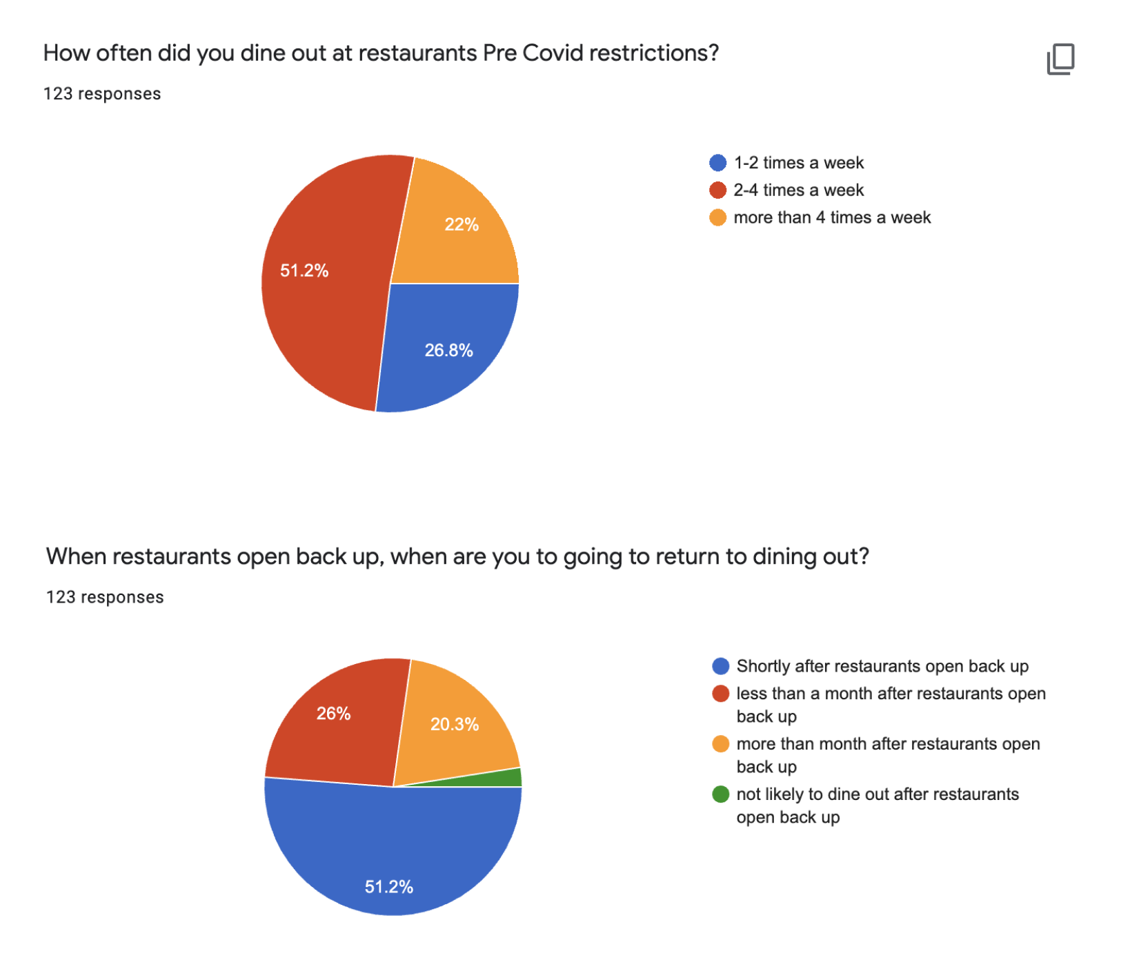
Concerned about changes in habits due to safer-at-home measures, I leveraged the screener to take a quick pulse on user habits and expectations in the middle of lockdown.
Responses informed us that around 75% of our core demographic was eager to get back to dining out after COVID restrictions were lifted. At the time, this was positive news for our launch with local restaurants and bars in Los Angeles.
Persona development
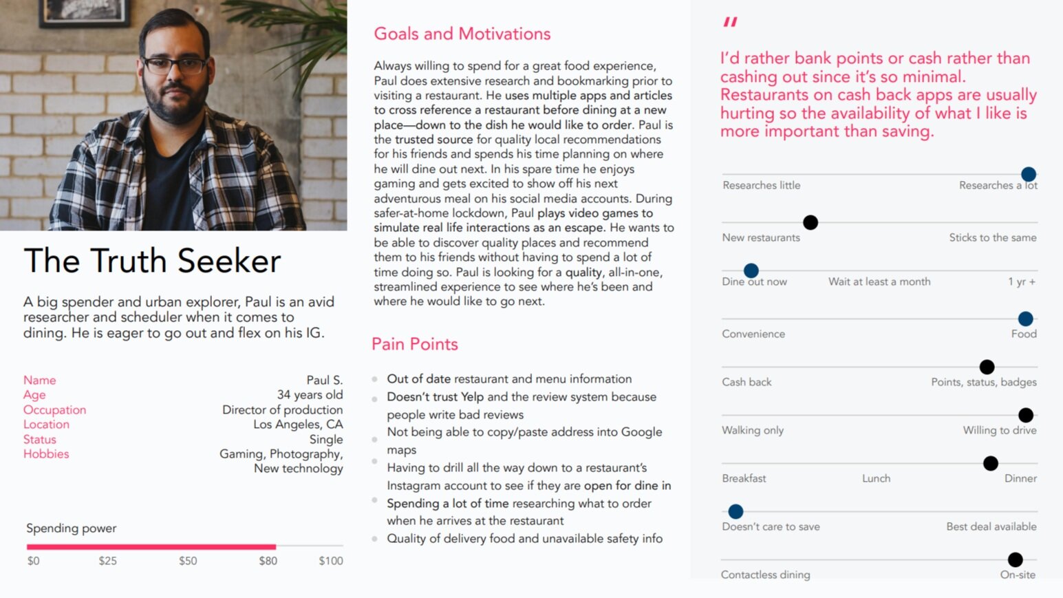
Insights from moderated remote usability sessions were synthesized with stakeholders in a collaborative effort to define personas. We utilized these personas to validate and update our value proposition for MVP. This effort was instrumental in developing cohesion with marketing, brand, tone and voice as we worked together to bring our ideas to life.
In depth insights
Perceptions of our prototype for Surkus Local were positive and helped us validate that we had a product that people wanted to use. Some of the key takeaways from the remote usability sessions were:
We needed to alter the perception of deals as being “cheap” or a “downriver” so we worked with the sales team to establish a minimum criteria for onboarding businesses onto our platform. We wanted curate quality over quantity.
Perceptions of a total percentage off per deal was better received that a specific dollar amount cash back. Users were not excited about getting $1-$5 back so we altered our deal cards to reflect percentage discounts.
Users were eager to share deals with their friends so we added this concept as a fast follow feature to promote app virality
Users assumed after they unlocked all three deals they would get a bigger incentive for being a business patron. We also added this as a fast follow feature called ongoing deals.
Extended government mandates that prohibited indoor dining meant we needed to pivot our launch strategy to include other types of businesses. Categories and filters were added to launch.
Updated deal card mechanics to promote ongoing deals
Deliverables - Bringing it all to life
When it came to handoff, I implemented a system that Spotify uses with their Figma design files. We tagged all of our design files with a proper thumbnail and kept a master document as the single source of truth. Working files were kept in a sandbox off to the side and once approvals were met, components were created and added to our design system. Updates would then be pushed to the master design file working much like production level code.
This workflow would provide design, engineering, and product with a single source of truth. Figma’s versioning feature would allow us to track changes to the master as well which kept things organized. We made sure that all of our files had IA flowcharts, and referenced designs for alternate states. Our design system, built in Figma then pushed to Zeroheight, was created with atoms, molecules, and organisms (components) with auto-layout applied so that spacing would maintain if marketing needed to update copy.
Challenges
One of the biggest challenges to the success of this project was due to tight budgets. Throughout testing, we planned for the Plaid API to connect to the user account and search for the purchase on an ongoing basis. In reality, this was not the case.
As it turns out, the cost to have the API constantly screen every user that links their account was too high. So product decided to downgrade our integration which would require the user to manually verify their purchase—completely changing the workflow that was tested. Since this was non-negotiable, we exposed redemption states in the UX to accommodate.
Another challenge that we overcame was creating something completely new—with old parts. Since Surkus Local was a sub-product within existing platform, we had to tie into the old admin system and reuse as much as we could. We had to wedge new workflows into existing frameworks which meant re-educating internal admin users.
Lastly, tight budgets meant tight timelines. We often had to design and groom moving parts of the project with very little time in-between. Engineers skipped over design system recommendations, designers and project managers were being laid off, and we were left with a lot of tech debt during the QA process. Many important items were swept under the rug and we did not see them until beta testing.
UI Redlines after beta audit
Retro - Lessons learned
We shipped Surkus Local onto the app store on August 7th 2020 for its beta launch in Los Angeles. Four months after I joined the team we were able to bring a product to life operating completely remote, decentralized, during the largest pandemic in US history. I am extremely proud of this body of work because it represents the culmination of everything that I’ve learned in my career— applied collaboratively. Here are some of my key takeaways from this project:
Being assertive and leading from the start. Joining a new team and co-leading a launch, especially during the new normal made it hard for me to be assertive right away. I did not want to come off as bossy or circumvent anyone so I often times relied on retro or weekly one-on-ones to address difficulties in execution. Since we were under a time crunch, it would have been better to address issues as soon as they arose. Being honest with the team and establishing leadership early on would have saved some time. Being an Aries, I think I was a little too radically self aware.
Building quick vs. building smart. There was a lot of short-sightedness within our team in reusing existing infrastructure. In trying to launch a new product with old parts, we inevitably ended up with a lot of the old product. If I had to do this all over again, I would have spent more time helping PMs understand that shortcuts end up as waste and rework. If we would have focused on the users instead of the launch date, we would have ended up with a better product.
You can have all of the data to back up your decisions, and still be wrong. When COVID struck and lockdown measures were in place, we felt like there was an opportunity for us to launch during a rebound—when businesses opened back up. Little did we know, a second wave of restrictions put in place due to the rapid spreading of the virus would pummel local small businesses. We were left trying to operate a two sided marketplace with just one side.
Leaving on a high note. Although I was laid off two weeks after we shipped to the iOS store. I am glad that there is a workable model and a functioning MVP for our sales team to pitch. In it’s current form, Surkus Local works without any further design iterations as long as in-door dining and local businesses are allowed to resume. The fact that I don’t have to be there in order for the business to resume validates that we built a successful MVP and I’m grateful for the experience.


